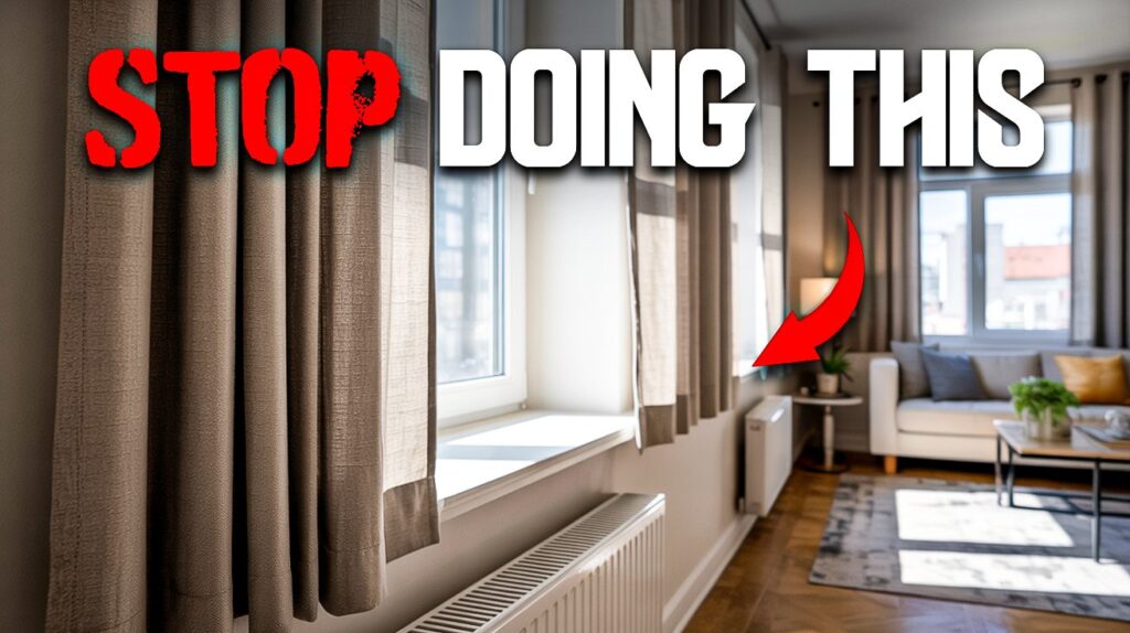
A bare apartment can be a blank canvas—but fill it the wrong way, and it starts looking like every other copy-paste rental on your block. Short curtains, mass-produced prints, and builder-grade doors all conspire to shrink a room’s personality, no matter how much you spent furnishing it. Even details as small as rug scale or the harsh glow of a single ceiling fixture can tip a space from inviting to bargain-bin. The difference between cheap on a shoestring budget and chic isn’t money—it’s intention, and every overlooked choice adds up fast.
9. Generic Art and Mass-Produced Quotes
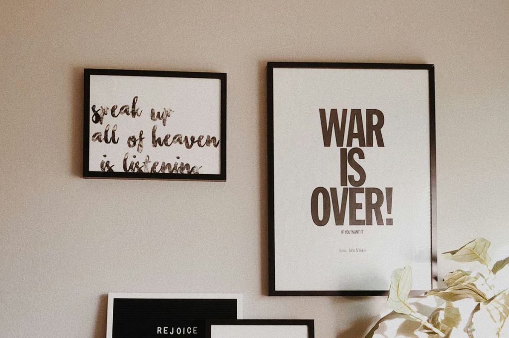
Those ubiquitous “Live Laugh Love” signs and HomeGoods gallery walls might fill space, but they’re doing your style zero favors. Anyone scrolling through apartment tours knows the drill—the same botanical prints appear in every feed, making each space feel like a copy of a copy. Instead of defaulting to what’s available, hunt for thrifted pieces, frame family photos, or embrace empty walls until something meaningful appears. Curated beats cluttered every time.
8. Short or Cropped Curtains
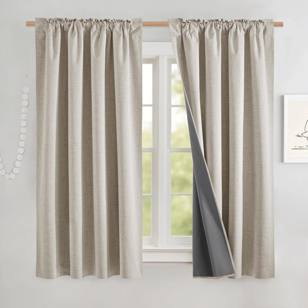
This mistake hits harder than most because it’s pure physics: short curtains visually chop your ceiling height and make rooms feel cramped. The fix transforms any space—hang curtain rods higher and wider than the window frame, choose panels that graze or pool on the floor, and suddenly your rental feels custom-designed. Steam those panels too, because wrinkled curtains broadcast “gave up” louder than a Monday morning alarm.
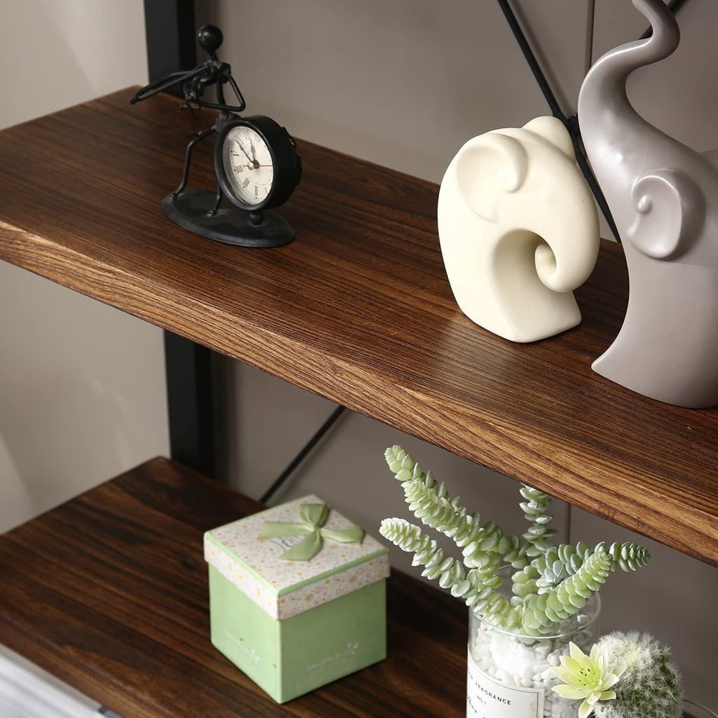
7. Lack of Texture

Smooth, glossy surfaces everywhere create spaces that look cheaper than they cost. High-end interiors mix textures like a DJ mixes tracks—woven baskets, ceramic vases, natural wood, brick accents, linen throws. Even budget-friendly materials like jute rugs or knitted pillows add visual interest that screams intentional design. The goal isn’t expensive materials; it’s creating layers that make eyes want to linger.
6. Over-Reliance on Overhead Lighting
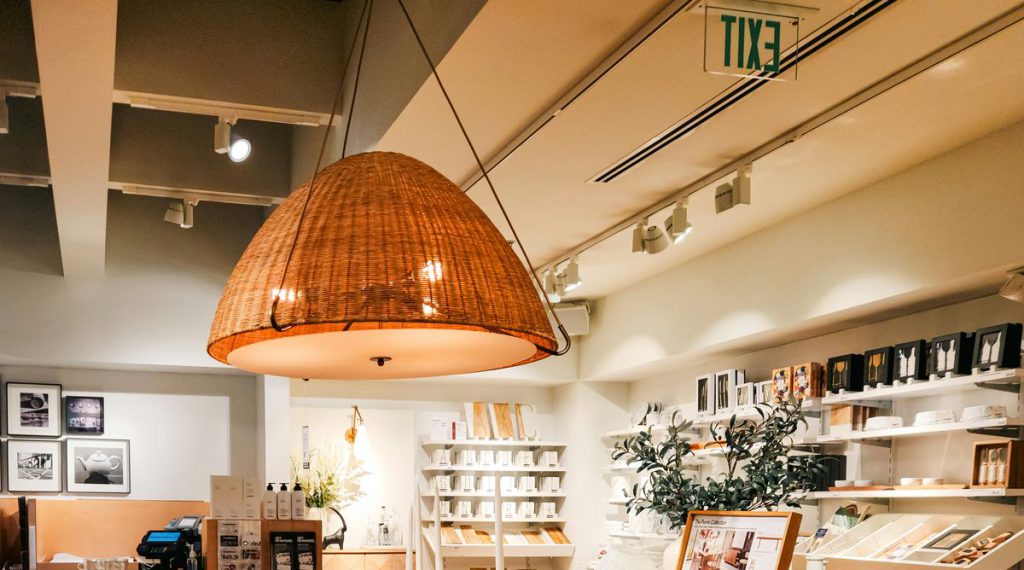
That basic ceiling fixture everyone calls a “boob light” creates flat, harsh lighting that kills any ambiance you’re trying to build. Layer multiple light sources instead: table lamps for warmth, sconces for accent lighting, maybe string lights if you’re feeling particularly Gen Z. Good lighting makes cheap furniture look expensive, while bad lighting makes expensive furniture look cheap.
5. Wrong Scale for Rugs and Art

Undersized elements make entire spaces feel unbalanced and budget-conscious. Area rugs should anchor seating areas with front furniture legs on the rug, not floating awkwardly in the center like design afterthoughts. Wall art needs similar confidence—fill space proportionally instead of hanging postcard-sized prints on cathedral walls. Properly scaled pieces create that “expensive” visual weight.
4. Poor Quality Flooring
Worn vinyl plank and obviously fake laminate mark spaces as cheap faster than almost anything else. While replacing floors costs serious money, strategic area rugs can cover problem areas and add warmth. Large rugs especially help disguise flooring sins while creating defined spaces within rooms.
3. Builder-Grade Trim and Doors

Thin baseboards and flimsy interior doors telegraph “rental property” immediately. These builder-grade elements often get overlooked during decorating, but upgrading even selectively creates disproportionate impact. Thicker trim and solid-core doors (even on just main areas) instantly elevate the entire space’s perceived value.
2. Matching Furniture Sets
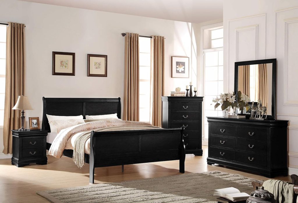
Overly coordinated pieces lack the character that makes spaces feel curated and personal. High-end interiors mix vintage finds with new pieces, creating collections that look gathered over time rather than purchased in one shopping trip. Related tones and styles work better than identical everything—think family reunion, not factory production line.
1. Excessive Open Shelving and Visible Clutter
Too much visible storage and everyday chaos creates visual noise that cheapens spaces regardless of how much money went into furnishing them. Store utilitarian items out of sight and curate what remains visible—fewer, more intentional displays make spaces feel luxurious rather than overwhelmed. Sometimes the most expensive-looking choice is simply having less stuff on display.
The thread connecting all these mistakes? They prioritize convenience over intention, quantity over quality, and trends over personal taste. Good design isn’t about spending more money—it’s about making thoughtful choices that reflect care, creativity, and understanding of how spaces actually work. Your home should tell your story, not the story of whatever was cheapest or easiest to find.
Last modified: September 22, 2025